


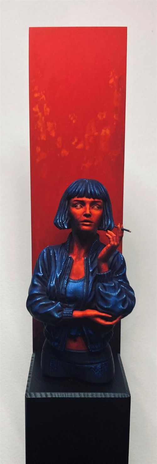
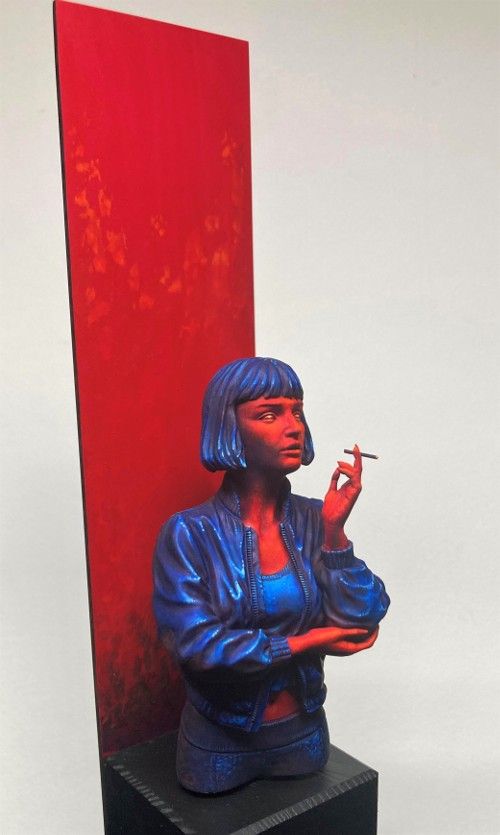
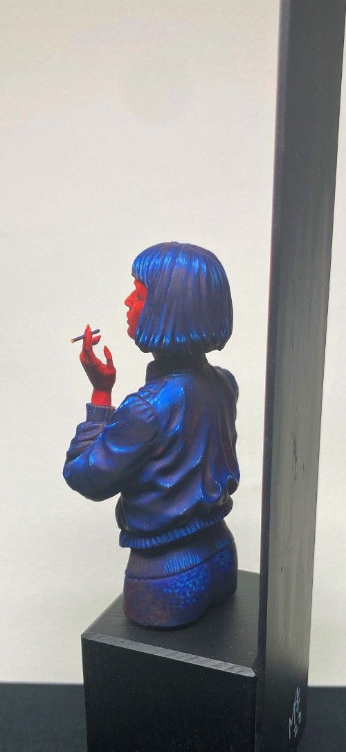
The painting is done in a watercolour-like fashion over a red primer. I used purple and paynes gray to create shadows and left the red shining through in her clothes. The skin is shaded with a bit of purple and highligted in a few spots with orange. Mostly I tried to just leave the red as the highest value in the skin, but I felt like it needed just a little more. I therefore added a bit of cadmium orange to her face and hand, and glazed over it with red. The cadmium pigments are very luminous and that luminosity shines through the red glaze a little bit. The main stars of the paint scheme is naphtol red and pthalo blue. Dioxacine violet, cadmium orange, white and pastel yellow play supporting roles.
The process of painting this bust is some of the mose satisfying painting I have done. Painting with these vivid colours was a real indulgance. Unfornutately they are rather hard to photograph. The bright colours and hard contrasts really mess with my camera. Therefore some of the more suptle tones get lost in the pictures.
Anyway. I hope you like this piece. Would love to hear what you think of it :-)

Erkka MarttioPLUS
Lovely work mate, the colour scheme is super striking. Hope to see this in flesh one day!
Mikkel Frederiksen
Thank you. Would love to get to show it to you :-)
Melnikov Ivan "Nakatan"
Great color choice
Mikkel Frederiksen
Thank you. You cant go wrong with primaries :-)
Steph.DPLUS
Sperbe figurine, j’adore la mise en scene, bravo
vote forcement Or pour toi ...
Mikkel Frederiksen
Thank you :-)
Alexander "Skrytnik" Loskutov
Gold!
Mikkel Frederiksen
Thank you :-)
Jerry Allen
I love the artistic freedom you exercised with this piece. Fantastic work! Gold
Mikkel Frederiksen
Thank you Jerry. I think maybe the artistic freedom part, was the hardest part of painting a figure like this. I get ideas like this often, but plucking up the courage to act on them is harder, than it should be.
OrigalumPLUS
Interesting contrast work. It looks nice - gold from me!
Eugene Dravskikh
Looks very impressive! Only gold!