Good job and idea.
Maybe blush on his cheeks and nose could be a little bit different in hue or contrast to reduce such reddish on his face, but still, it looks great! Gold
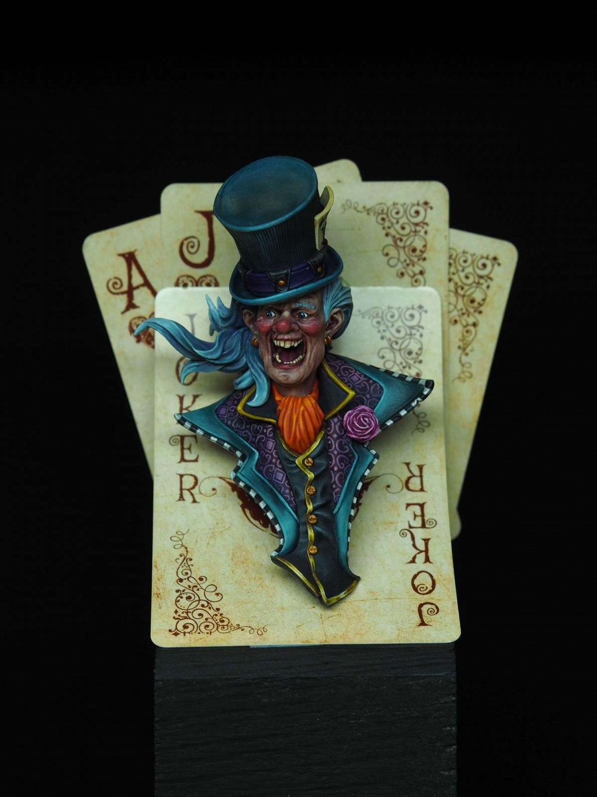
I think you have done a marvelous job and the set up is a great idea. Personally, the red nose and cheeks add to the horror of this character - a alcoholic that you definitely don’t want to mess with!
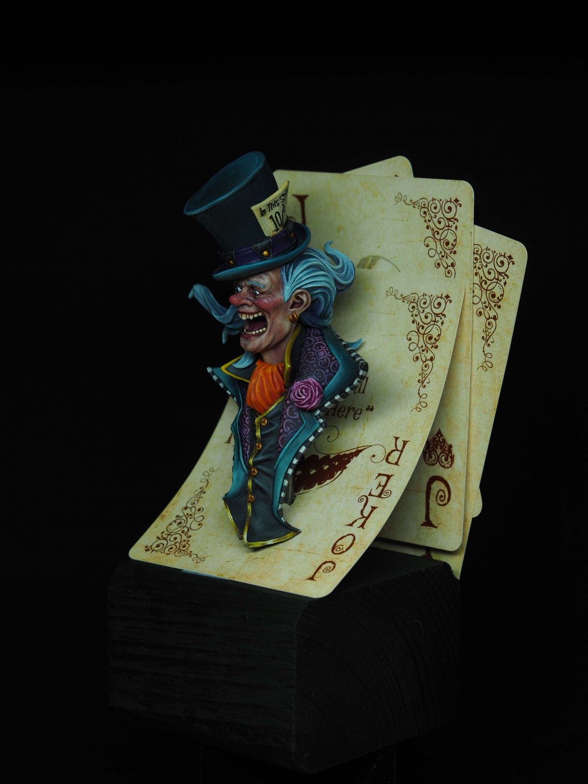
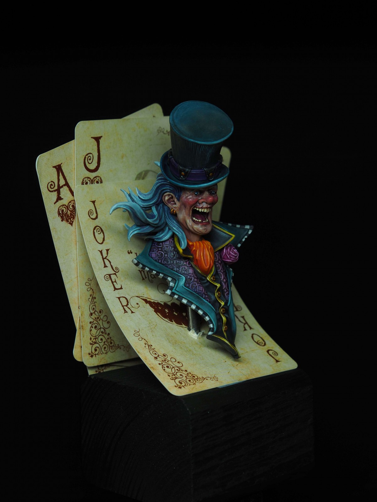
I really like this one! The setup with the cards is very fitting and lovely done. The weathering on the cards too. The quality of the paintjob is really good in balance, light and detail. Everything works and belongs there. Nice, tiny NMM. Everything makes sense. You are asking for feedback though and mine will be just my personal brainstorm, constructive ideas I see when I look at a project that already works and has the most important thing: impact. Well done!
My feedback. I think the orange cloth around his neck draws too much attention. On one hand it pulls the viewer in, but also distracts from the face again after a brief second and the face should be the element on a bust where my eyes come to rest. This cloth could be a tiny bit more desaturared, but having the same effect, framed by all the blues for your complementary contrast effect.
What also would build up to that effect is - in my eyes at the moment - minimal distracting: You bring in a second complementary contast via the yellowish weathered cards, the NMM and the purple parts on the bust. I think if the cards would not play that contrast (keep it to the NMM gold and the parts on the figure) and would be tinted in some dirty orange look it would benefit the overall blueish bust more. It could also be worked in as upper half yellowish while the lower part of the cards get slight orangy feel to it.
Thank You very much for the very detailed and constructive feedback!
I didn’t thought about tinting the cards in the background to create a gradient - I really love this idea!
And I feel like it will change a lot in general view of the mini.
I will try to desaturate the orange cloth too, so the attention will stay on his face.
I’m really happy that You found him interesting and thank You again for all the kind words!


OrigalumPLUS
Good job and idea.
Maybe blush on his cheeks and nose could be a little bit different in hue or contrast to reduce such reddish on his face, but still, it looks great! Gold
Margharret
Thank You for Your comment and vote!
I agree with Your advice - I should have tonned his face down as it’s really reddish
Tommy Gunn
I think you have done a marvelous job and the set up is a great idea. Personally, the red nose and cheeks add to the horror of this character - a alcoholic that you definitely don’t want to mess with!
Margharret
Thank You very much! He has to look a little crazy as he is The MadHatter :D
And I really don’t want to mess with him!
Roman LappatPLUS
I really like this one! The setup with the cards is very fitting and lovely done. The weathering on the cards too. The quality of the paintjob is really good in balance, light and detail. Everything works and belongs there. Nice, tiny NMM. Everything makes sense. You are asking for feedback though and mine will be just my personal brainstorm, constructive ideas I see when I look at a project that already works and has the most important thing: impact. Well done!
Roman LappatPLUS
My feedback. I think the orange cloth around his neck draws too much attention. On one hand it pulls the viewer in, but also distracts from the face again after a brief second and the face should be the element on a bust where my eyes come to rest. This cloth could be a tiny bit more desaturared, but having the same effect, framed by all the blues for your complementary contrast effect.
What also would build up to that effect is - in my eyes at the moment - minimal distracting: You bring in a second complementary contast via the yellowish weathered cards, the NMM and the purple parts on the bust. I think if the cards would not play that contrast (keep it to the NMM gold and the parts on the figure) and would be tinted in some dirty orange look it would benefit the overall blueish bust more. It could also be worked in as upper half yellowish while the lower part of the cards get slight orangy feel to it.
Roman LappatPLUS
Nonetheless, this is high level feedback and I hope my thoughts are helpful!
Thank you for being so open to feedback! Often this is rare on this page!
Keep on happy painting!
Margharret
Thank You very much for the very detailed and constructive feedback!
I didn’t thought about tinting the cards in the background to create a gradient - I really love this idea!
And I feel like it will change a lot in general view of the mini.
I will try to desaturate the orange cloth too, so the attention will stay on his face.
I’m really happy that You found him interesting and thank You again for all the kind words!
Marc Revés
Very original idea!! Good job!!!
Margharret
Thank You very much for Your comment!
Štěpán Tichý
The original idea for the plinth is just awesome! And I feel like everything, constructive, was greatly said by Roman. Great piece!
Margharret
Thank You very much for commenting, that’s indeed a lot of great feedback to think about!