


This has been indeed the first bust I have ever painted, and therefore it supposed to me an extra challenge as I believe that in this format, if you want to transmit a message or tell a history, you really have to go one step further in the painting process. This was quite challenging for me as I am yet a newbie on thousands of things, such atmosphere, selection of palette, color theory, etc., as well as I don't master many techniques for the moment. But in any case, personally this figure has meant a lot to me, as I have been able of doing things I couldn't imagine.
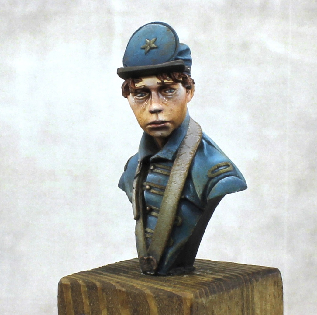
Regarding the bust, and as you may see, I have tried to represent the deepest feelings of a young (and not so long ago full of illusion) soldier, that has just experienced the cruelty of war, and the consequences of defeat. As he was standing in the rearguard, he has been just a spectator of the nonsense of war, but that has changed him forever. I hope I more or less conveyed this message and background in the piece :)
And now, I ask you all to please comment this figure, give me all your feedback, and criticise it as much as you can, as I know it is the only way for me to continue improving, step by step, in this fantastic world. Thank you so much in advance!!
All the best guys!

Trent "BigDeno" Denison
In my experience, you don’t tend to get a lot of feedback constructively on this site. But, since you asked I will try to give some!
Firstly I think the plinth actually lets the model down. It is grainy, the lettering isn’t at the same quality as the rest of the model.
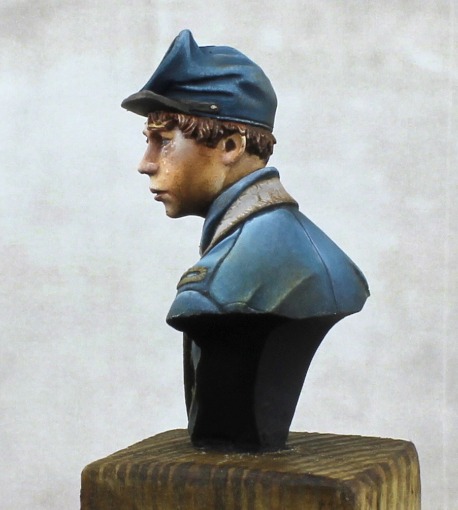
The eyes are well done but I think possibly you could have gone further with them.
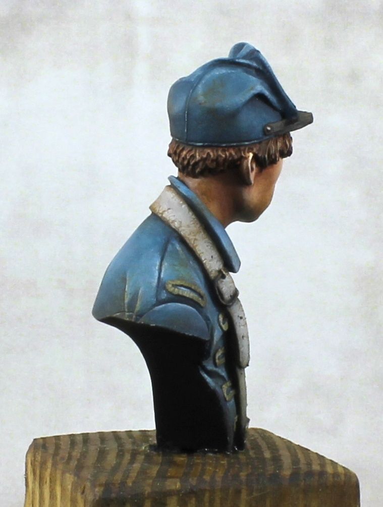
The blue is really nice, the weathering and use of colour is great. The skin feels a tiny bit too orange to me, I would’ve used a bit more purple or green in the skin just to break it away from the blue. The leather effect is really well painted, but I think the biggest issue with the whole model is the contrast. All of the colours on the model start at the same dark value and increase to the same light value. There needs to be more contrast both between sections, and then also higher and more saturated on the areas that you want to draw focus to.
But truly this is a model to be proud of, well done.
Luis Salamanca "Herald"
Wow Trent, thank you so much for such fantastic feedback!! If I get at least one comment like this one on every miniature published, it will be totally worthy for sure!
Totally agree with the plinth thing. I always get super excited when getting close to the end of the painting process, and I use to rush… shame on me, as those small final steps are so important!!
And now, let’s move to your comment about colours, light and contrast, but first, again, thank you so much for such fantastic feedback, I do really appreciate it! First, although the orange tone of the skin was intended, to contrast with the blue, without any doubt it would have gain a lot with some more greenish or purplish shadows. Regarding the contrast in the miniature, I also agree with you, and that is something I really have to learn, as it is really difficult for me so far to create this light and saturation contrast gradients, and use them to create focal points. many things to keep in mind for the next one :)
All the best!!