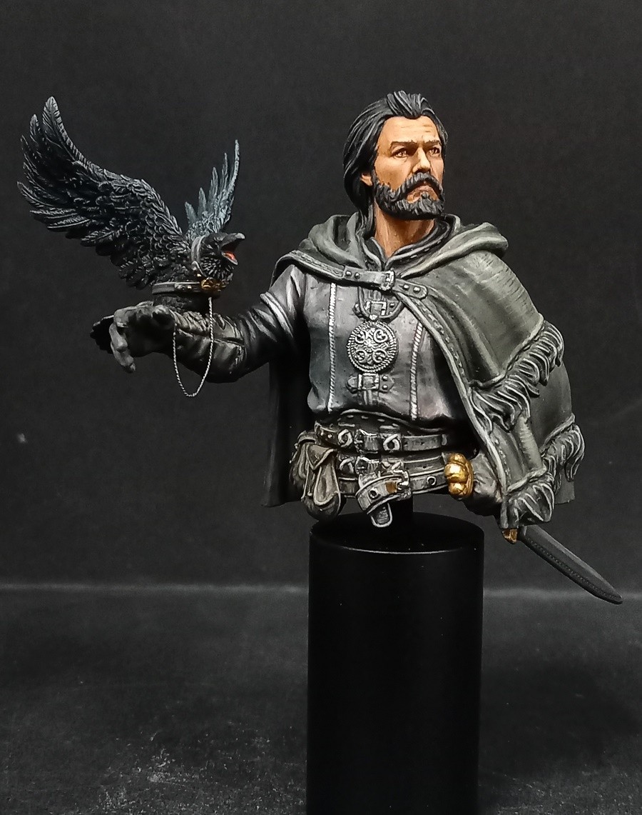
Here is my last work, which I called "The Master of the Birds". This is a small 3D resin bust, 1/16° print. The subject reminded me of the series "Game of Thrones" and I wanted to treat this one in the spirit of the "Night's Watch".
The difficulty for me was to paint this piece entirely in black, giving it all the necessary nuances so as not to fall into uniformity. I hope you enjoy this work, and all your comments are welcome.
All painted with PA acrylics
Since you said all comments are welcome, here ya go:
Great concept on it, but it seems incomplete in general, and most of the “blacks” read as gray to my eye. The skin tones of the face need more shading, some highlighting, and a touch of pink somewhere to give him some life - otherwise his skin seems like plastic. If you want the material to read as black, at least the deepest shadows for all “black” material need to be black instead of dark gray. You can also vary the way you highlight black; a black leather might fade through very low saturation browns to highlight, but a black wool may fade through grays.
Thank you Rhiana for your comments, although I note that, once again, you remain faithful to the only note “Bronze” that you have ever given to all my achievements, even those which only received this note from you when more than 50 others voted “Gold”. But it’s your right, and I respect it. Obviously, you don’t like my style of painting… Too bad. Regarding your remarks, I absolutely do not agree with what you say about the treatment of the face. This ranges from dark brown to pure white for maximum lighting. He is a rough man, weathered by the outdoors, and to add red to his skin tone seems inappropriate to me. For the rest, it’s true that the room is a little gray, the fault of the lighting of the photo first of all, and also, how else to bring nuances to it and, above all, to make the crow more possibly black? It’s just a matter of contrast ratio.
In any case, thank you for finally having the courage to express your opinion, it is appreciated!
It is not a matter of courage in the slightest. It is only because you finally stated you would receive comments. I do not make a practice of giving critique when it isn’t requested as a matter of politeness, and I do not take offense when given a bronze honestly.
Not much red is needed in skin to make it seem alive. Faintest amount. A weathered man still has blood flow after all.
Cameras can be tricky and my own photos sometimes get washed out too.
Contrast ratio on painting black is true, but there are many ways to achieve that using a variety of textures, types of black (veering slightly into different hues), or how sharp highlights are on different materials. The thing they all have in common is that the deepest shadows end up darkest black, if you want them to seem black. Otherwise they’ll seem to be shades of gray.
Hallo Eric,
ich möchte mich nicht wiederholen, aber auch dies ist eine interessante Szene und guter 3D Druck.
Mir gefällt die Bemalung in schwarzen Farben und wie die die Lichter und Schatten gesetzt sind
Gold.
Danke Pit Rehmke. Ihre Kommentare sind sehr angenehm für mich und ich freue mich zu sehen, dass ich das Ziel erreichen konnte, das ich mir gesetzt hatte, wenn Leute wie Sie hier diese für mich etwas ungewöhnliche Arbeit an den Schwarzen schätzen!
Thank you Rhiana for your comments, although I note that, once again, you remain faithful to the only note “Bronze” that you have ever given to all my achievements, even those which only received this note from you when more than 50 others voted “Gold”. But it’s your right, and I respect it. Obviously, you don’t like my style of painting… Too bad. Regarding your remarks, I absolutely do not agree with what you say about the treatment of the face. This ranges from dark brown to pure white for maximum lighting. He is a rough man, weathered by the outdoors, and to add red to his skin tone seems inappropriate to me. For the rest, it’s true that the room is a little gray, the fault of the lighting of the photo first of all, and also, how else to bring nuances to it and, above all, to make the crow more possibly black? It’s just a matter of contrast ratio.
In any case, thank you for finally having the courage to express your opinion, it is appreciated!
it was not my intention to disappoint you. But I have the same piece I’m working on .. I really like how you made the fabrics. I voted bronze because, but that’s just my opinion, some more shadow and light could be created on the face.
Bronze isn’t a mark of shame, nor is it with mean spirit. It means there was something enjoyed, and something to improve upon. See the enjoyed part? That’s important.
Hello Eric! Considering how you’ve stated you want direct, frank feedback after receiving a medal, here’s what I think of the piece:
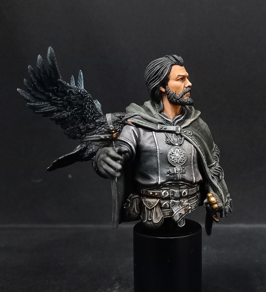
I like the idea behind it, I enjoyed how you rendered the volumes on the face, i liked the raven and the leather glove but I think there are some aspects of the execution that could be improved:
- the overall value composition seems a bit off. Some areas are painted as if the light was coming from the top left of the model (the face) while some areas look as if there’s light coming from the bottom right (the shirt). Looking from the main angle it’s hard to focus on the face because it’s not particularly framed nor does it have any feature that grabs attention. Maybe it’s because of the harsh lights you’re using for the picture, but the highlights on the green cape and the shirt are much more attention grabbing than the face, which I assume was supposed to be the focal point.
- I feel like the skin looks flat, specially the first picture. It’s lacking contrast in both value and hue. I made a quick photoshop sketch to illustrate what I mean and how a bit more color and shadows could improve the result while still keeping the rough looking aspect.
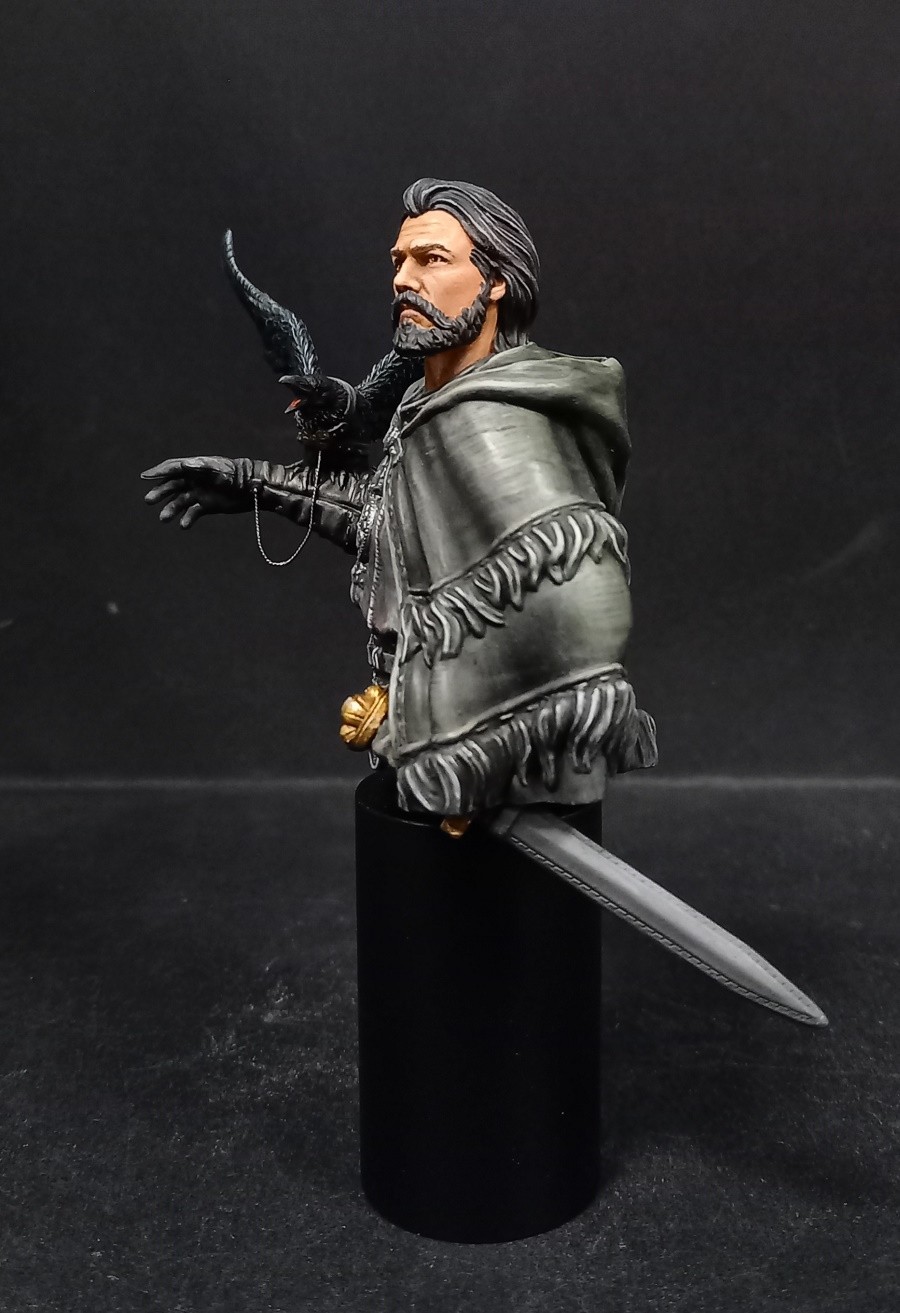
- The light work on the hair looks off. It look as if you drybrushed the sculpted ‘strands’ instead of treating the hair as an object and highlighting it based on the volumes it has and the lightsource direction. Here’s the quick sketch showing some edits on the face and hair https://i.imgur.com/Maj7EYi.gif The same issue can be seen on the fur on the cape.
- Apart from the raven and the leather glove, I have a hard time reading what each material is supposed to be. The painting doesn’t explore how different materials will have different textures, their surfaces will interact with the light and the colors around them.
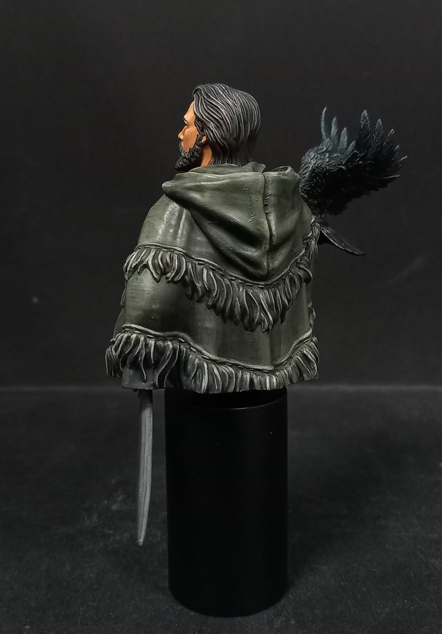
This is something that’s particularly difficult to achieve, in my opinion, but I think it’s extra important when using such a limited palette. The cape is an example of that, it currently looks glossy and to me it feels like plastic.
- I don’t think the leather belt and the shirt look black, to me it reads distinctly gray, a light grey, more specifically.
- I think the bust doesn’t look like it is inserted into any environment. It feels as if each object/component was painted individually instead of it being an alive being that’s somewhere.
- Finally, something that’s not related to painting per se, but it’s related to the end result: the pictures could be improved a lot by using less harsh, direct lights. The lights you used for the pictures created some really sharp shadows and i’m pretty sure they’re washing out a lot of detail and color variation from the miniature.
I hope you enjoyed painting it! It looks cool!
(end)
Bel exercice, on sent la différence de traitements des différents vêtements noirs, que je trouve très réussi sur le corbeau mais peut-être un peu trop désaturé encore sur la tunique (même si encore une fois j’ai l’impression que la photo joue des tours et que l’éclairage blanchit un peu le tout sur les zones de lumière). Bravo quoi qu’il en soit pour cet exercice pas évident, l’esprit night watch est là ;)
La pièce qui a fait parler sur le forum, moi je trouve tes tons excellents , c est très difficile le noir et tu t en sors admirablement bien , j adore le noir de ton corbeau ! Bravo une belle dorée!
Merci beaucoup Fabien. C’est un exercice difficile que de traiter une pièce sur une seule base, et tout le monde n’est pas aussi doué que Mike Blanke à ce niveau. J’ai essayé de faire de mon mieux !


girlpainter57
beautifully painted subtle differences in the black values and hues gold
eric wolfsPLUS
Many thanks, Girlpainter.
Rhiana, "Cyradis"
Since you said all comments are welcome, here ya go:
Great concept on it, but it seems incomplete in general, and most of the “blacks” read as gray to my eye. The skin tones of the face need more shading, some highlighting, and a touch of pink somewhere to give him some life - otherwise his skin seems like plastic. If you want the material to read as black, at least the deepest shadows for all “black” material need to be black instead of dark gray. You can also vary the way you highlight black; a black leather might fade through very low saturation browns to highlight, but a black wool may fade through grays.
Hope this helps!
eric wolfsPLUS
Thank you Rhiana for your comments, although I note that, once again, you remain faithful to the only note “Bronze” that you have ever given to all my achievements, even those which only received this note from you when more than 50 others voted “Gold”. But it’s your right, and I respect it. Obviously, you don’t like my style of painting… Too bad. Regarding your remarks, I absolutely do not agree with what you say about the treatment of the face. This ranges from dark brown to pure white for maximum lighting. He is a rough man, weathered by the outdoors, and to add red to his skin tone seems inappropriate to me. For the rest, it’s true that the room is a little gray, the fault of the lighting of the photo first of all, and also, how else to bring nuances to it and, above all, to make the crow more possibly black? It’s just a matter of contrast ratio.
In any case, thank you for finally having the courage to express your opinion, it is appreciated!
Rhiana, "Cyradis"
It is not a matter of courage in the slightest. It is only because you finally stated you would receive comments. I do not make a practice of giving critique when it isn’t requested as a matter of politeness, and I do not take offense when given a bronze honestly.
Not much red is needed in skin to make it seem alive. Faintest amount. A weathered man still has blood flow after all.
Cameras can be tricky and my own photos sometimes get washed out too.
Contrast ratio on painting black is true, but there are many ways to achieve that using a variety of textures, types of black (veering slightly into different hues), or how sharp highlights are on different materials. The thing they all have in common is that the deepest shadows end up darkest black, if you want them to seem black. Otherwise they’ll seem to be shades of gray.
pit rehmke
Hallo Eric,
ich möchte mich nicht wiederholen, aber auch dies ist eine interessante Szene und guter 3D Druck.
Mir gefällt die Bemalung in schwarzen Farben und wie die die Lichter und Schatten gesetzt sind
Gold.
eric wolfsPLUS
Danke Pit Rehmke. Ihre Kommentare sind sehr angenehm für mich und ich freue mich zu sehen, dass ich das Ziel erreichen konnte, das ich mir gesetzt hatte, wenn Leute wie Sie hier diese für mich etwas ungewöhnliche Arbeit an den Schwarzen schätzen!
"SCV Park" Yeong Min
Good~!
eric wolfsPLUS
Thank you :) !!!
Angel C Villalba "KaspareK"
Oro!!! Gran trabajo.
eric wolfsPLUS
Muchas gracias, su voto es muy apreciado.
Clive Jackson
Love the subdued palette Eric…difficult piece, but I think you have pulled it off! Gold!
eric wolfsPLUS
Great thanks Clive !!
Sandro Zinzeri
Gold ! Un exercice difficile et à mon avis réussi.
eric wolfsPLUS
Merci Sandro. C’était un exercice de style, comme on dit !
Merci pour ton vote !
Sergey Cheremshantsev
Gold!
eric wolfsPLUS
Great thanks Sergey !
eric wolfsPLUS
Thank you Rhiana for your comments, although I note that, once again, you remain faithful to the only note “Bronze” that you have ever given to all my achievements, even those which only received this note from you when more than 50 others voted “Gold”. But it’s your right, and I respect it. Obviously, you don’t like my style of painting… Too bad. Regarding your remarks, I absolutely do not agree with what you say about the treatment of the face. This ranges from dark brown to pure white for maximum lighting. He is a rough man, weathered by the outdoors, and to add red to his skin tone seems inappropriate to me. For the rest, it’s true that the room is a little gray, the fault of the lighting of the photo first of all, and also, how else to bring nuances to it and, above all, to make the crow more possibly black? It’s just a matter of contrast ratio.
In any case, thank you for finally having the courage to express your opinion, it is appreciated!
Tommaso Cefalo - inkminiatures
Add a comment
Tommaso Cefalo - inkminiatures
very nice
eric wolfsPLUS
You say very nice but you vote “bronze ” !!
eric wolfsPLUS
That’s not a nice vote
Tommaso Cefalo - inkminiatures
it was not my intention to disappoint you. But I have the same piece I’m working on .. I really like how you made the fabrics. I voted bronze because, but that’s just my opinion, some more shadow and light could be created on the face.
Rhiana, "Cyradis"
Bronze isn’t a mark of shame, nor is it with mean spirit. It means there was something enjoyed, and something to improve upon. See the enjoyed part? That’s important.
Francesco ThauPLUS
Gold
eric wolfsPLUS
Great thanks Francesco !
John Delamere
Great differentiating of the blacks.
eric wolfsPLUS
Thank you John. Vote could be appreciated
Marc MussatPLUS
belle piece !
j’aime bien l’ambiance générale qui en ressort
eric wolfsPLUS
Merci Marc, un petit exercice sur les noirs pour moi. Dommage que les photos ne rendent pas justice au visage.
Lucas 'Tio Zebra'
Hello Eric! Considering how you’ve stated you want direct, frank feedback after receiving a medal, here’s what I think of the piece:
I like the idea behind it, I enjoyed how you rendered the volumes on the face, i liked the raven and the leather glove but I think there are some aspects of the execution that could be improved:
- the overall value composition seems a bit off. Some areas are painted as if the light was coming from the top left of the model (the face) while some areas look as if there’s light coming from the bottom right (the shirt). Looking from the main angle it’s hard to focus on the face because it’s not particularly framed nor does it have any feature that grabs attention. Maybe it’s because of the harsh lights you’re using for the picture, but the highlights on the green cape and the shirt are much more attention grabbing than the face, which I assume was supposed to be the focal point.
(1/2)
Lucas 'Tio Zebra'
- I feel like the skin looks flat, specially the first picture. It’s lacking contrast in both value and hue. I made a quick photoshop sketch to illustrate what I mean and how a bit more color and shadows could improve the result while still keeping the rough looking aspect.
- The light work on the hair looks off. It look as if you drybrushed the sculpted ‘strands’ instead of treating the hair as an object and highlighting it based on the volumes it has and the lightsource direction. Here’s the quick sketch showing some edits on the face and hair https://i.imgur.com/Maj7EYi.gif The same issue can be seen on the fur on the cape.
(2/??)
Lucas 'Tio Zebra'
- Apart from the raven and the leather glove, I have a hard time reading what each material is supposed to be. The painting doesn’t explore how different materials will have different textures, their surfaces will interact with the light and the colors around them.
This is something that’s particularly difficult to achieve, in my opinion, but I think it’s extra important when using such a limited palette. The cape is an example of that, it currently looks glossy and to me it feels like plastic.
- I don’t think the leather belt and the shirt look black, to me it reads distinctly gray, a light grey, more specifically.
Lucas 'Tio Zebra'
- I think the bust doesn’t look like it is inserted into any environment. It feels as if each object/component was painted individually instead of it being an alive being that’s somewhere.
- Finally, something that’s not related to painting per se, but it’s related to the end result: the pictures could be improved a lot by using less harsh, direct lights. The lights you used for the pictures created some really sharp shadows and i’m pretty sure they’re washing out a lot of detail and color variation from the miniature.
I hope you enjoyed painting it! It looks cool!
(end)
Theodoros Giannakopoulos
Great result of a difficult task .
Pierre Balmette
Bel exercice, on sent la différence de traitements des différents vêtements noirs, que je trouve très réussi sur le corbeau mais peut-être un peu trop désaturé encore sur la tunique (même si encore une fois j’ai l’impression que la photo joue des tours et que l’éclairage blanchit un peu le tout sur les zones de lumière). Bravo quoi qu’il en soit pour cet exercice pas évident, l’esprit night watch est là ;)
eric wolfsPLUS
Merci beaucoup Pierre, je suis tres sensible a ton commentaire.
Fabien DOUGNIER
La pièce qui a fait parler sur le forum, moi je trouve tes tons excellents , c est très difficile le noir et tu t en sors admirablement bien , j adore le noir de ton corbeau ! Bravo une belle dorée!
eric wolfsPLUS
Merci beaucoup Fabien. C’est un exercice difficile que de traiter une pièce sur une seule base, et tout le monde n’est pas aussi doué que Mike Blanke à ce niveau. J’ai essayé de faire de mon mieux !
WojciechBober72
Szarości, czerń-ładnie współgrają-złoto
Evgeny Golubev
Looks superb ! Gold!