


I love dwarves, so I said: wow yes let's go for it...so I asked to Joaquin if he wants to do this, he said; yes of course!
...but at the end, for someone it's only a dwarf! even if it's different from the others ;)
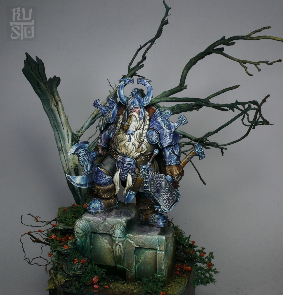
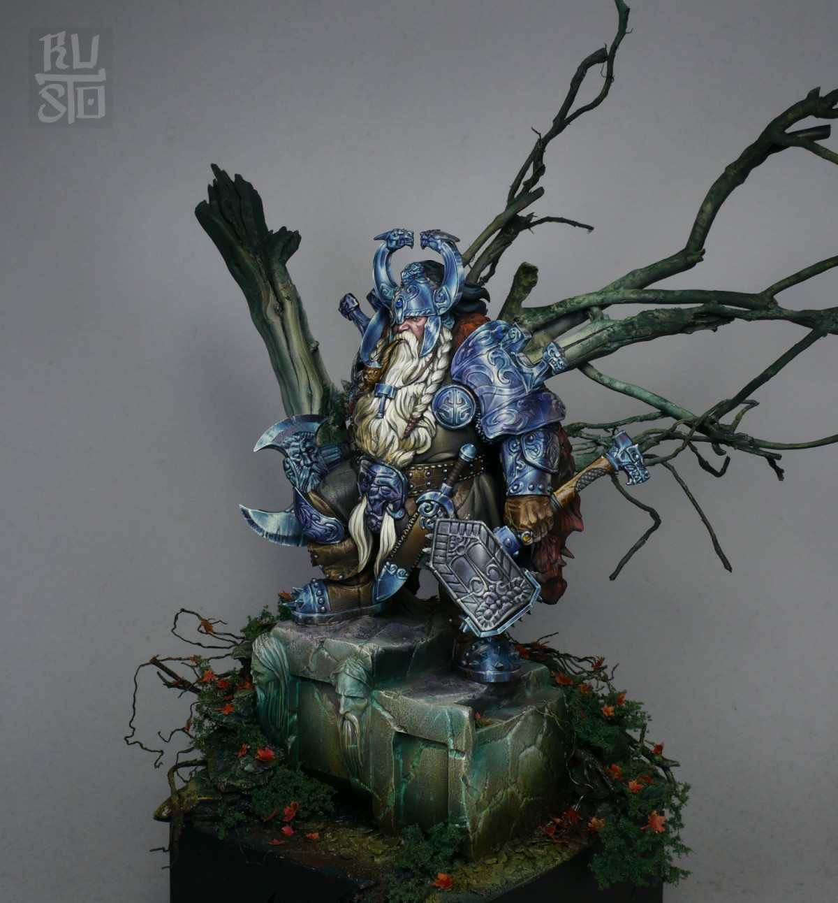
so I was searching for a special/personal way to paint it, and I decide to do what I love to do...play with colors, desaturated tones it's my decision to create his atmosphere, but...with a special attention on the position of grey and bluegrey
I've tried to fix the attention on the face, and all painted reflections as a circle to frame it.
in this case, grey helped me to create the stable part of the figure, and bluegrey is the instable and shining detail
something very complicated to explain and to paint for me, I hope with this explanation will be visible for you too!
at the end it was a "tone sur tone" paint with different grey and brown on a desatured pink face!
also the environment was done to create the circle effect, specially on the three.
I'm so happy and proud of this figure, because I think it's different from most of the scroll you can do on IG, that sometimes is boring, and I hope to see more attention on the approach on the figures...maybe I did mistake, and it's wonderful because I've got the opportunity to learn once again!
oh...it's a long text for me, but it deserved! comments and votes are welcome! CIAO...

Francesco "Franciuus" FarabiPLUS
this is a masterpiece.
ZABAART
mmmm! lovely work…...
Stefano LancioniPLUS
I loved this in real!! Gold!!
Max RichieroPLUS
Wonderful
RaTr
Bellissimo!!
Luca Riva
Great work, i truly loved it!!
Marco "Popi" Bosio
Fuori di testa. Bellissimo
Chris "D.Vader" SuhrePLUS
Gorgeous work mate. Gorgeous
Gianluca "Branzu" Buttigliero
Vabbè, ma che te lo dico a fare…
Josh "Zozimus" Pattison
The colours leaped out at me immediately. I don’t fully understand how or why, but they work so well! :) I like it when people experiment.
Alessandro "Alastar" Marinone
Uno dei pezzi più belli a mss ❤️
Gabriele Leni
FA VO LO SO !!
"SCV Park" Yeong Min
Very Nice painting~! Gold
JakeyZH
Beautiful!
Diego
Eccezionale!! Mi piace molto la scelta minimale della scena, che aiuta a esaltare, anche per la colorazione usata, il personaggio. I fiori rossi risaltano senza rubare la scenna al nano. Come scelta colori e colorazione mi ricorda le illustrazioni di Paolo Barbieri.
Ottimo lavoro
Davide Rapazzini
absolutely love it!!!
Marco "BigBlackBear" Orselli
Uajooooo ma di che parliamoooioo
marca77
Spiccava come un gioiellino …spettacolo fabri !!
Daniele "Found" TrovatoPLUS
Spettacolo. oro.
Roberto ''Barba'' Gerolimon
bomba clamorosa
Ale Moro
Awesome! Gold!
FranNarváez
Gold!
Anthony Wang
It’s amazing Fabri!!! The armor is so unique - I love it against the soft beard too. Just fantastic!
Alessia Amitrano
Hello! First of all, congratulations on another masterpiece! I think it’s really well constructed and it obviously shows your technical skill.
I only have one issue with this, that the tone of the armour is not in harmony with the colors used in the rest of the scene. In Italian I would say that for me the armour ‘fa a cazzotti col resto’. But it is only an opinion, what we call constructive criticism. Amazing work! Gold!
RUSTO art and craft show Fabrizio Russo
Ciao e grazie
Capisco benissimo cosa intendi ma è evidentemente una questione di gusto, per cui accetto la tua critica costruttiva e rilancio spiegandoti il mio gusto
Ho scelto il grigio blu come dominante nell’armata per fare uscire appena quello che sostanzialmente è un lavoro di grigi e marroni, infatti tutto il resto, tranne le parti verdi dell’erbaccia e il volto, è grigio o marrone…ovviamente con varianti all’interno per cercare di rendere più vibrante il tono
Non volevo lasciare tutto nella stessa tonalità l’armatura e non volevo assolutamente utilizzare il giallo oro o qualcosa di simile
Anche qua si tratta di gusto personale, di scelte
Trovo che il metallo non metallo giallo oro sia chiassoso, non ho ancora trovato una tonalità che me lo fa digerire
Ma soprattutto l’intento era proprio quello di pasticciare con pochi colori
Ti ringrazio ancora per il tuo messaggio, non chiedo di accogliere le mie scelte, ma sono contento di avertele raccontate e spero siano più comprensibili
Luis MartínPLUS
Fantastic work!
Steve Garcia
Beautiful. Definitely a masterpiece. Congrats my friend
TimPLUS
Wow, just incredible
Fabrizio SchiragaPLUS
Oro lavoro bellissimo