


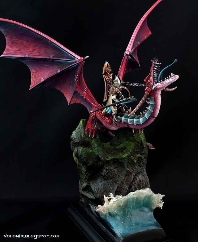
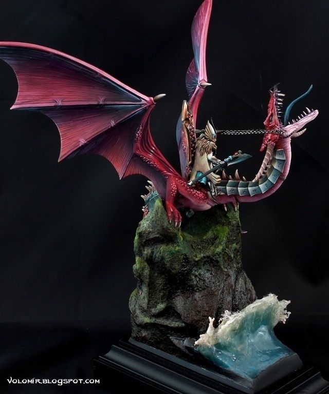
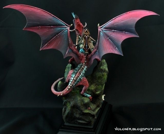
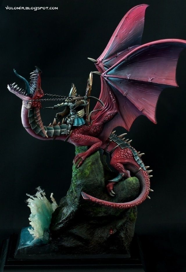
The Dragonlord went to Golden Demon Germany 2013 and won Gold in the Fantasy Monster category, the one where competition was probably the hardest. There are many people who I should thank for helping me greatly during the process of making it happen. I want to thank you all: the initial ideas and poses by Azotitos(Lord_azoth), the inestimable advice and help with the base by Jorge Valdés (lord_jasegev), the motivation, endurance and support from both my roomates Mike Young and Luis Alonso, the neverending and valuable council and help from master Elias Alonso (Morsi) and the essential emotional support of Mary Williams. And of course, each and everyone of you who followed the WIP article all those months, readers and commenters of the Internet. You guys made it possible. Thank you.
Don't forget to check out the endless Step by Step Article on my blog (volomir.blogspot.com). You will also find MUCH BIGGER PHOTOS! INSANELY SIZED! Any comments are very welcome and greatly appreciated, as usual.
Thanks for watching!

Philip PrinzPLUS
Such an impressive project!
When saw it the first time in Madrid, I thought crap he’s in the same category :D
I am very happy I saw it live and even saw you painting the final hours on it. I will never wash my bristle brush again you used for the rocks :D
Fesechko
Great work! You so like to make this cool waves and I always know when the work is yours!
Regards,
Radovan DarkTower Rybovic
EPIC!!!
Dirk R.
I have no words !
Meg Maples
Stunning!
Oliver Posvek (Colouristo)
A wondeful piece, also the water wave I like a lot
Alfonso Giraldes_BansheePLUS
creo q el error de este proyecto es empezar la cas apor el tejado. has elegido colores que funcionan bien, muy bonitos, pero lso has trabajado muy inocentemente.. muchoa ero y el juegod e tonos es inexistente.. son transiciones limpias, muy controladas, pero que le dan un aspecto muy de juguete. y no me malinterpretes, q te lo digo porque creo q kerias q fuese otra vez como antes y te fuese sincero. si fuese para juego te diria que es excelente, como las escuadras que tienes..q lo son..porque para ese proposito son muy muy buenas.. pero si es una figura de vitrina.. mas alla del megacurro q supone una cosa tan grande, hay temas q tendrias quye tener en cuenta. primero la escultura.. te has pegado un palizon modelando, sin haberte molestado en entender como doblaria un cuello tan largo y tan pesado..
Alfonso Giraldes_BansheePLUS
piensalo y te daras cuenta de lo mal que funciona esa torsion y mucho ams aun segun como agarra las bridas a una mano.. en conclusion, y si te interesa te comento incluso con mas profundidad.. es un proyecto gigante en el que te has quedado corto. y te hubiese compensado mas en mi opinion hacer otro tipo tributo a los caidos pero con la capacidad tecnica que tienes ahora que es mucho mayor.. y por otro lado..mete pincel `pero no solo para puntos de luz o definir, sino para interpretar volumenes, porque el problema del aero es que te vicia y al final es muy dificil salir de esos acabados plasticos. ademas a menos que lo controles muchisimo, el juego tonal se va a ver afectado por el hecho de que la textura que te ofrece es un ruido muy evidente y te impide jugar con distintas opacidades, trazadas, densidades y demas, q solo te lo permite el juego mixto de pincel+aerografo. espero q lo entiendas como lo q es,. consejo de viejo.
Alfonso Giraldes_BansheePLUS
ahora lo positivo. creo sinceramente que no estas explotando la mejora que has pegado.porque por ejemplo es muy evidente en la cara y en pekeños detalles como el asiento, o la definicion extrema… mi consejo es.. o te pintas algo grande perod e escala, nod eta,maño q te fuerce a soltarte.. o si vas a seguir pintando escalas pekeñas , pillate algo bueno de verdad y explotalo al maximo, porque la de aquiles por ejemplo no esta a este nivel tecnico.. pero las de infinity si son un buen campo de pruebas porque el hecho es que aunq te pueda guista mucho.los dragones de gw son para echarlos de comer a parte y si no tienes buenos volumenes que te sugieran , vas a tirar por lo que ya conoces.. eso si lo que quieres es ver una mejora tangible.. a nivel tecnico ya la hay. esto es mucho mejor q el diorama de los marines.. pero a nivel de como resulta la imagen final, como comentario a nivel profesional lo que te he dicho tiene muchos entido. espero haberlo sabido explicar bien
Cristina Piras "Violet"
Owesome!