


Is a very hard exerciseThere are a lot of little details that unfortunatelly are maybe too subtle to point out easily.but I will explain everything in an article for Figure Painter Magazine as soon as i have a bit of free time to do it.
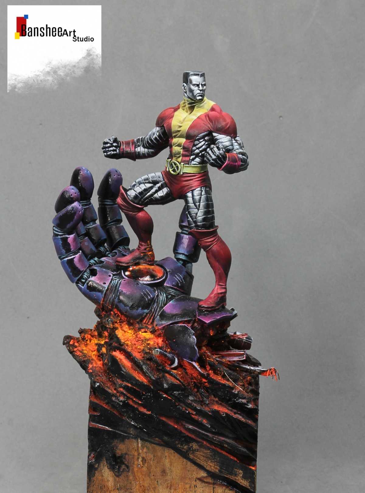
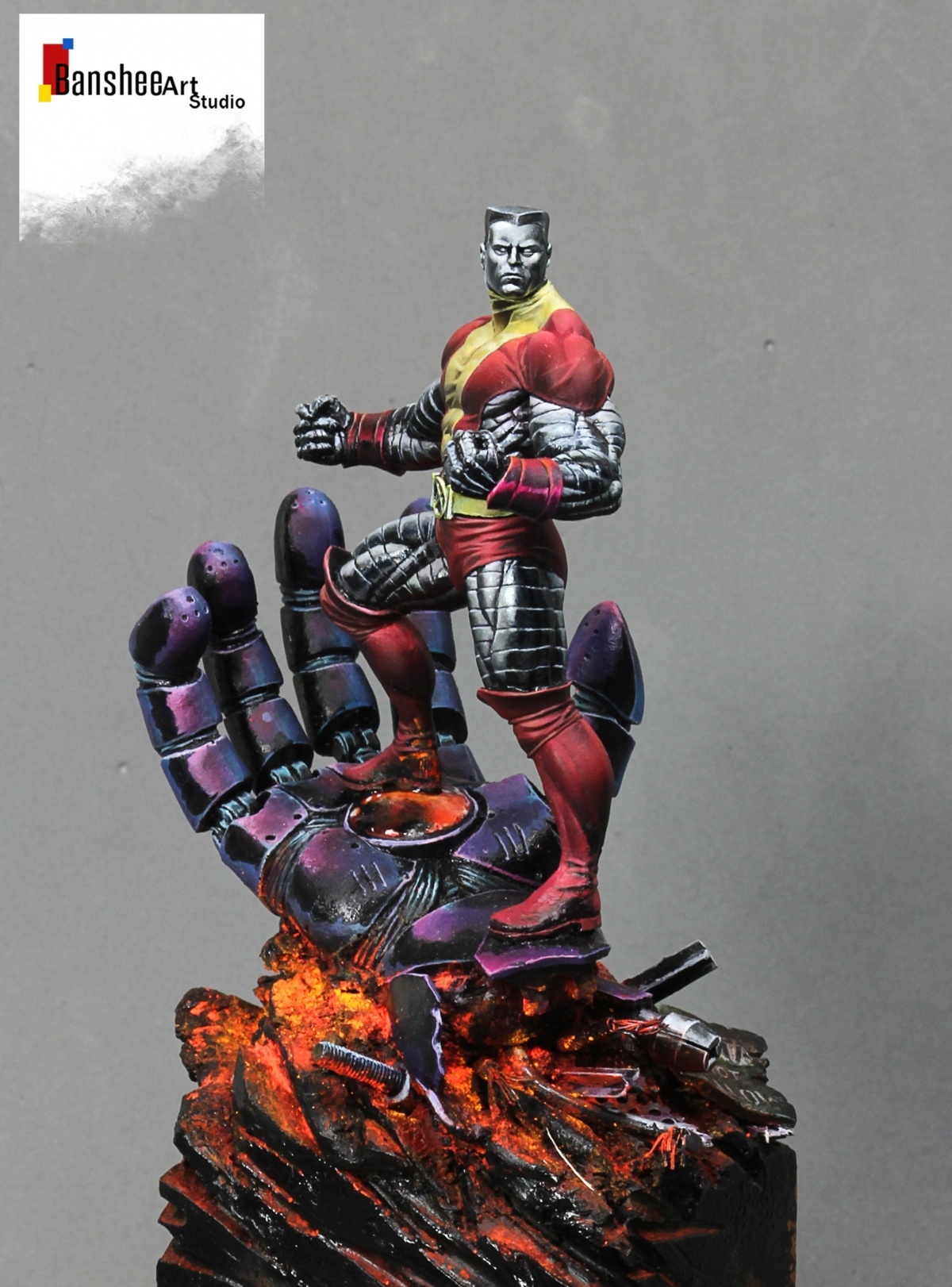
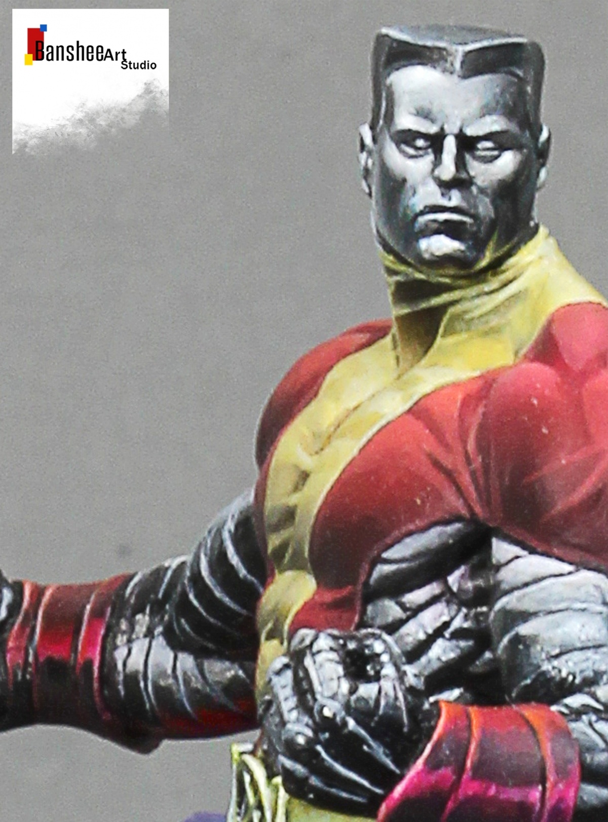
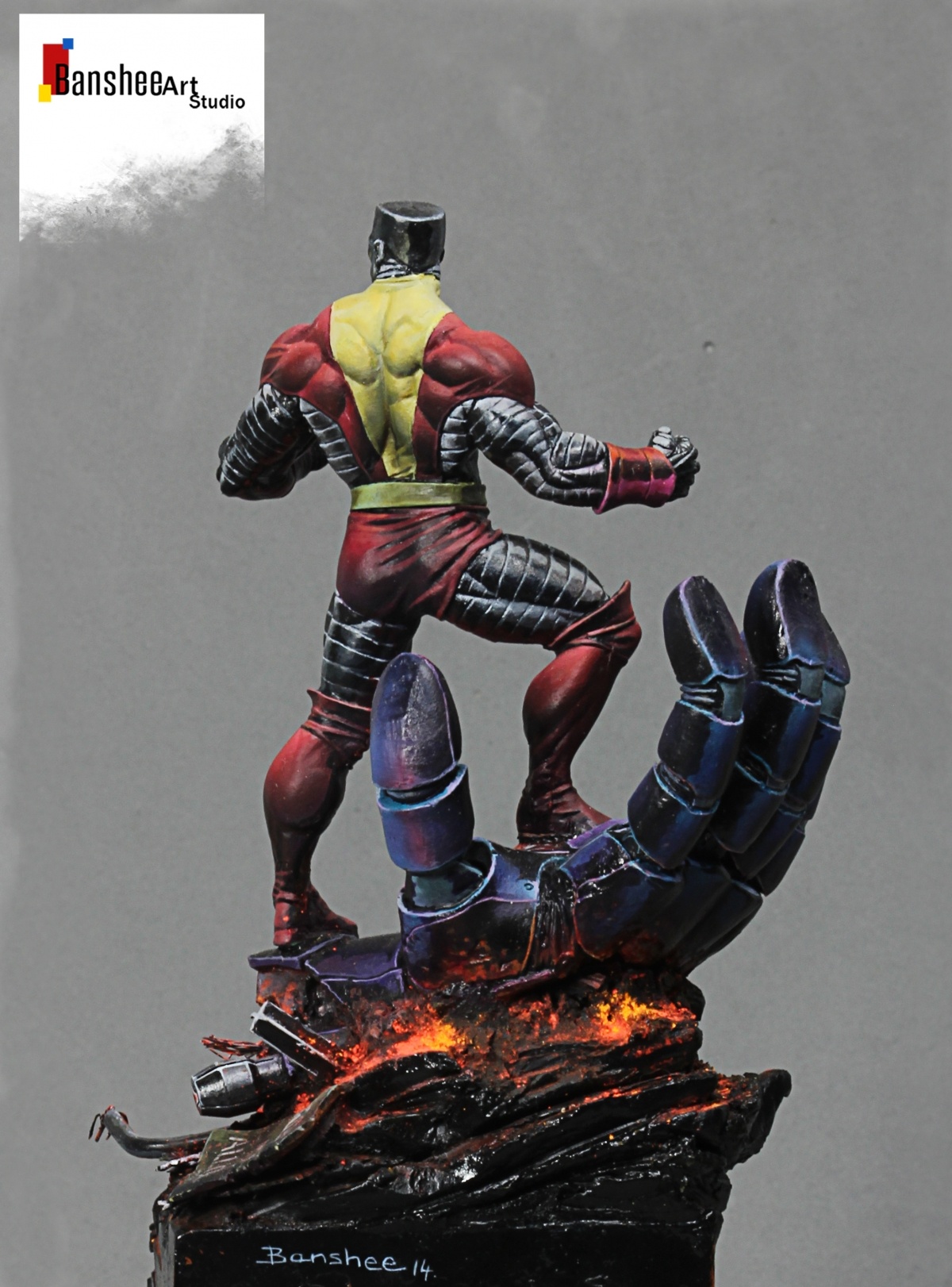
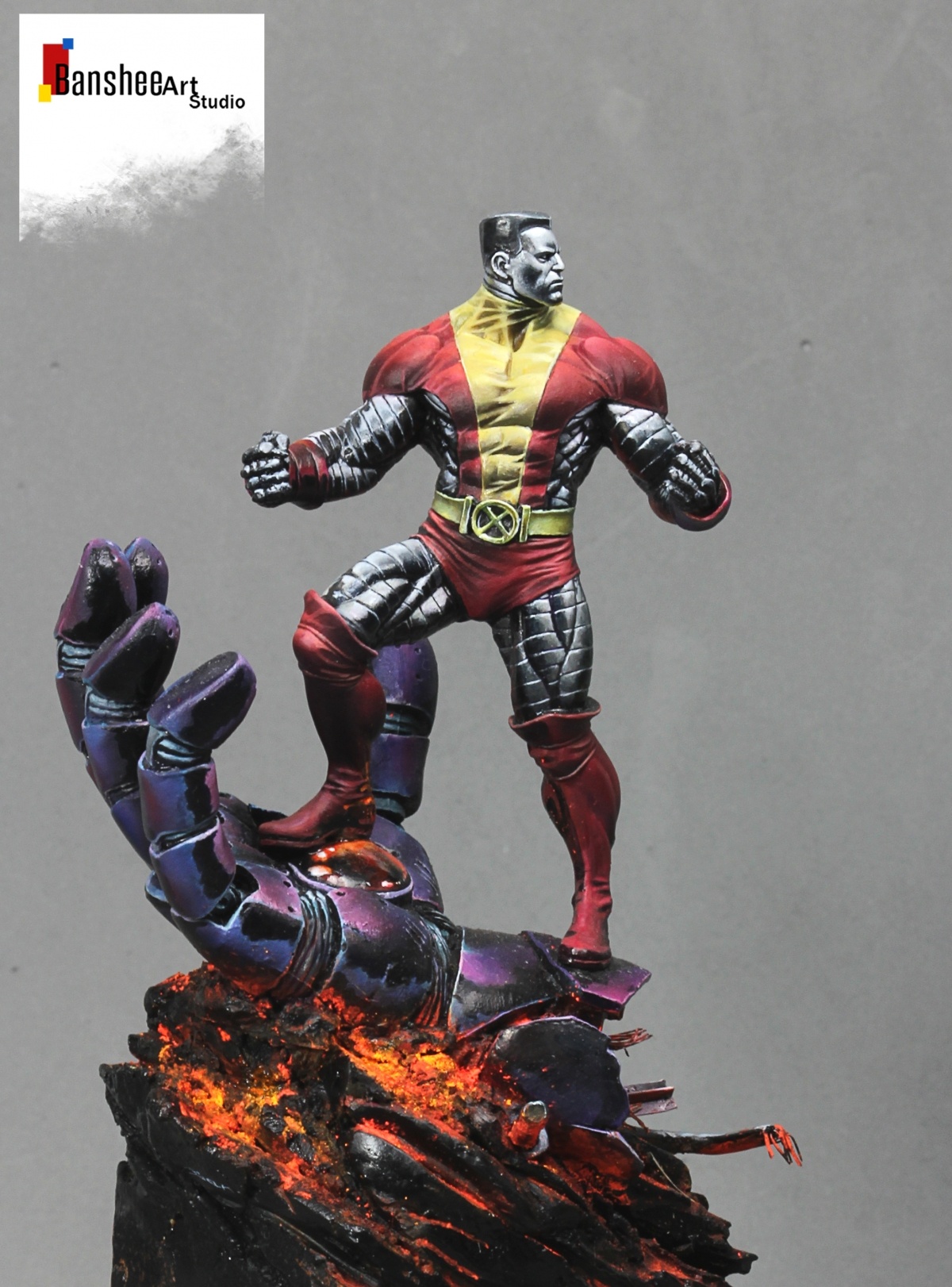
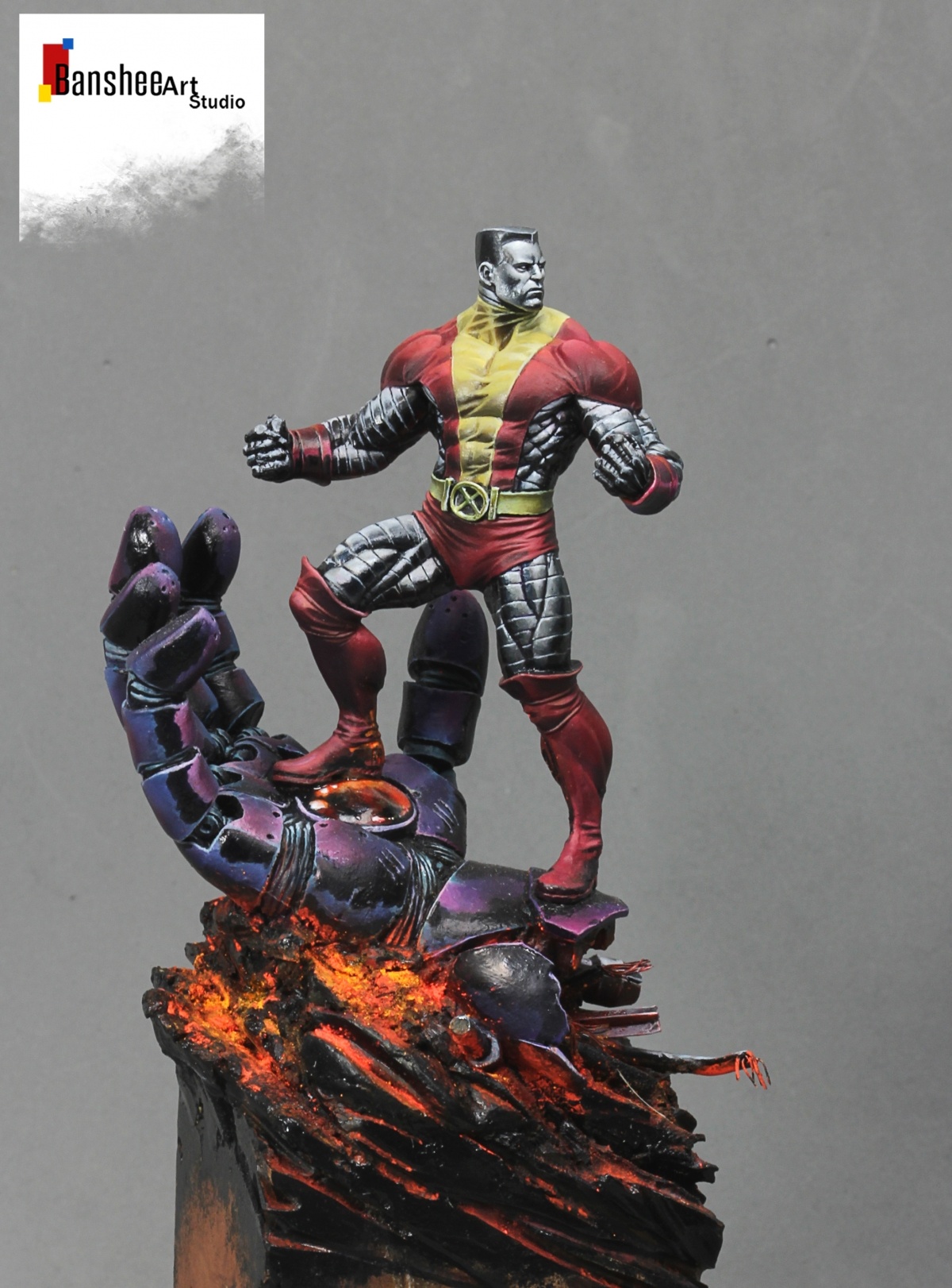
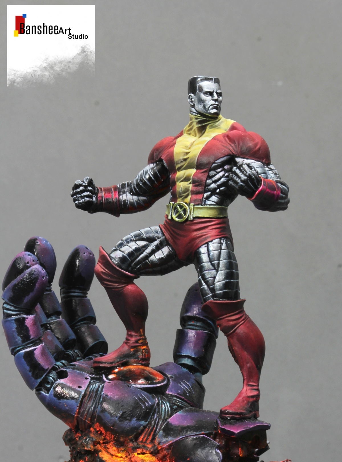
the quantity of different kind of contrast is huge, between, matt, satin, glossy, dull and pastel colour against vibrant saturated ones, complementary and harmonic composition and the interaction between the base (also painted by hand) and the figure.
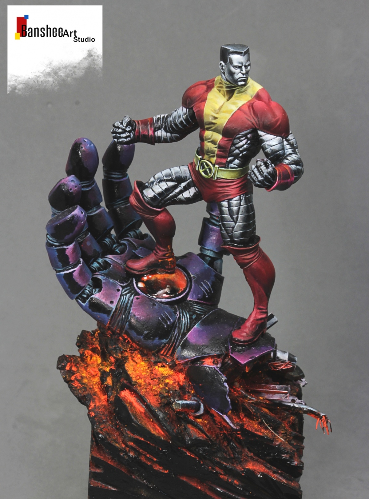
the metallics are true metallics, but generated in an illustration style, as i have been developing for many years since I did it for the Knightmodels range. Normally i would use a more controlled palette of matt and satin colours and also inks. but here decided to achieve the chrome metallic effect with a serie of true metallics in oposition to the more desaturated colours of the suit. I didn't want a latex suit to generate more contrast between matt suit and bright metallic effect, but controlled as a non metallic treatment to focus on the focal points i wanted without distracting with effects , lights and high contrast everywhere..what i mean is that is one of my most controlled figures ever.
collector: J-Christophe

Ricardo Pisa
Superb.
Alfonso Giraldes_BansheePLUS
thanks
John Keys aka megazord_manPLUS
Love it!
Alfonso Giraldes_BansheePLUS
thanks
Alfonso Giraldes_BansheePLUS
next time hope to see u painting in my workshop baby. hugs
Neil Szabo AKA "Zab"
It’s beautiful.
Alfonso Giraldes_BansheePLUS
thanks mate
Ivan Fernández "miniatures_ivan"
Fenómeno.
Alfonso Giraldes_BansheePLUS
gracias tio
Dr34m
Awesome work - lovely contrasts :D
Alfonso Giraldes_BansheePLUS
that was about.. many different kind of contrasts..you got it! thanks
FranNarváez
Genial! ORO!!!
Alfonso Giraldes_BansheePLUS
gracias
schiragaPLUS
Wow…
Alfonso Giraldes_BansheePLUS
yeeepaaa! jejeje thanks
Borja Garcia
Excellent work Alfonso ;). A big huge
Alfonso Giraldes_BansheePLUS
gracias makina
Jonathan Hart
Excellent! It’s like a page from a colour comic, but in HD and far, far better.
Alfonso Giraldes_BansheePLUS
gracias jonathan . me alegra q haya gente que lo valore. es un camino abierto.
Davide Rainone
Astonishing work…
One of my favourite painted miniatures EVER!
Alfonso Giraldes_BansheePLUS
thanks davide. a big big hug!
Fulvio"jumanji"Pagliettini
Wonderful job
Alfonso Giraldes_BansheePLUS
thanks
Luis Méndez Juanola
Cuando veo tus últimos trabajos haces que sólo me fije en la pintura y en cómo la aplicas. Miro poco la miniatura, o me importa un poco menos. Ahí lo dejo!
Excelente búsqueda! Me apasiona por donde vas!
Alfonso Giraldes_BansheePLUS
un comentario alentador y muy bonito. me alegra q lo percibas asi. para algunos solo son manchas sin fundir.. es uno de los comentarios mas bonitos q he leido en mucho tiempo. espero seguir ofreciendote eso cuando veas mis kekos
BerenMiniatura
Tu apellido es innovación, y tu nombre experimentación…. ;) Oro sin duda maestro.
Alfonso Giraldes_BansheePLUS
y mi segundo apellido es lafacturadelaluzestamucara..jejjjejeje. gracias tio. me halaga que algunos lo veais asi. es lo que busco.. seguir buscando
Jay Martin (Redrum)PLUS
I love the illustration feel to this, always pushing the boundaries!!
Alfonso Giraldes_BansheePLUS
thanks jay
Jero Miniatures
La miro y remiro y me gusta cada vez más . Uffff que maravilla Alfonso…